How to Visualize Connections in Insurance Data
We process information mostly visually, so it's always nice to have a schema or a representation somewhere when trying to understand concepts or ideas. In traditional databases, tables can be visually represented to get a better look at what we are dealing with and how those tables are connected via foreign keys. In graph databases, we take this to a whole new level. Graphs are networks of nodes connected by relationships that can get quite large and intertwined but also have a meaningful structure to them.
The insurance industry handles various data regarding individuals with insurance policies, incidents, vehicles, and claims. There are many benefits to organizing and storing this data in graph databases, and, using Memgraph, you can render graphs, look into claims, inspect suspicious actors, and more.
At a quick glance, we can see which nodes have many connections, like when an individual has many policies or was involved in many incidents in order to make certain recommendations, revisit contracts or detect fraud. On the other hand, we can see isolated incidents or visualize the size of payments made for insurance claims. We can also spot communities of fraudsters (fraud rings). Almost all graph data has some structure, and as nodes have labels, they make up a schema which is also a graph that shows us the structure of our data.
Memgraph Lab
Once you import your data into Memgraph, you can use a visualization tool Memgraph Lab to:
- Generate graph schema
- Explore and manipulate data
- Customize vizualizations
Generate graph schema
A graph schema of insurance data in a graph database is also a graph. It allows you to look into the structure of your data and better understand how entities are related. For example, if we want to expand our data model with information about the vehicle’s lease or warranty in order to catch suspicious incidents occurring right before their expiration, we might want to look at the graph schema and determine how to incorporate this data into our model.
Lab also provides information about the percentage of entities (nodes and relationships) of a certain type with some property. Using that information, you can see how complete your dataset is, for example, if you are missing information on incidents that occurred. Possibly, if there are differences among a certain entity type, like traffic incidents and car theft, we might need different information on what happened, meaning we should probably split the incident nodes into two different types of nodes. Then you can model your data more easily by making a schema more understandable.
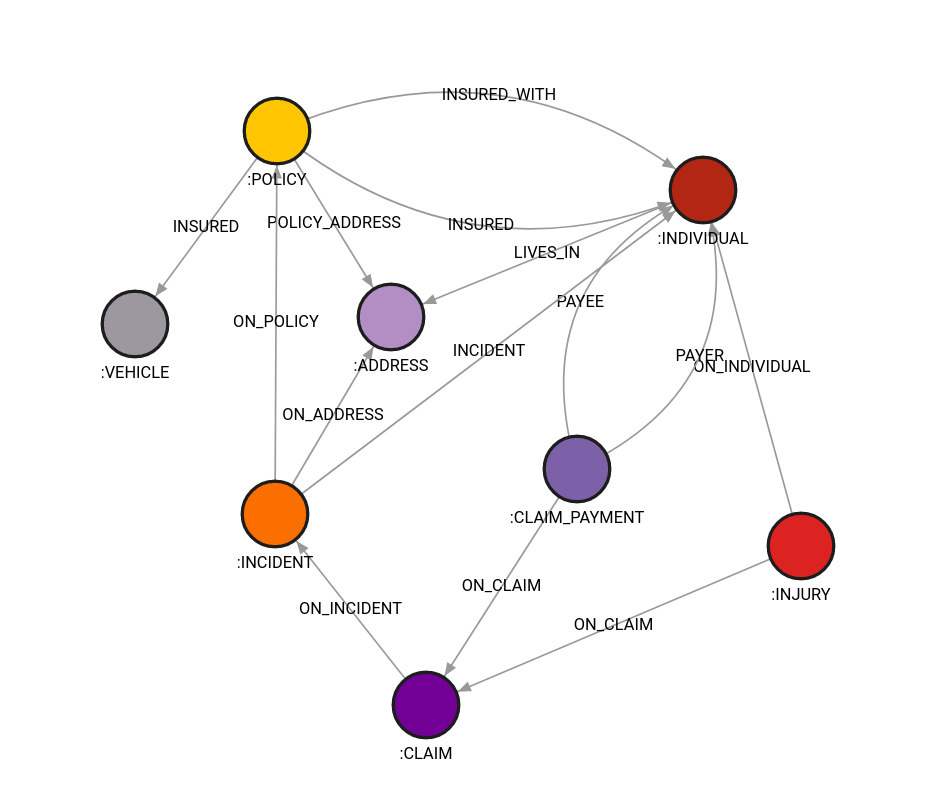
Figure 1. Insurance data graph schema
Explore insurance data and customize visualizations
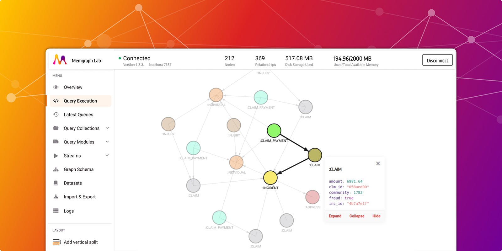
The visualizations generated while exploring and manipulating data can help discover relationships much easier than comparing results in a table. By looking at visual query results run on insurance data, you can quickly deduct how many people were involved and what injuries occurred. You can then flag fraudulent claims and determine which relationships connect individuals to those claims.
Inside Lab, you can run Cypher queries and get results in both list and graph form. The graph view can be seen in Figure 2. By running this edge expansion query, you get all nodes within 3 hops of a chosen claim.
MATCH p=(claim:CLAIM {clm_id: ‘a6a1edd5’})-[e*..3]-(m)
RETURN *
LIMIT 100;
By customizing nodes and adding images to them, as well as highlighting the relationships of interest, you can get a clear picture of involved insurance claims and parties, as well as the vehicles and injuries.
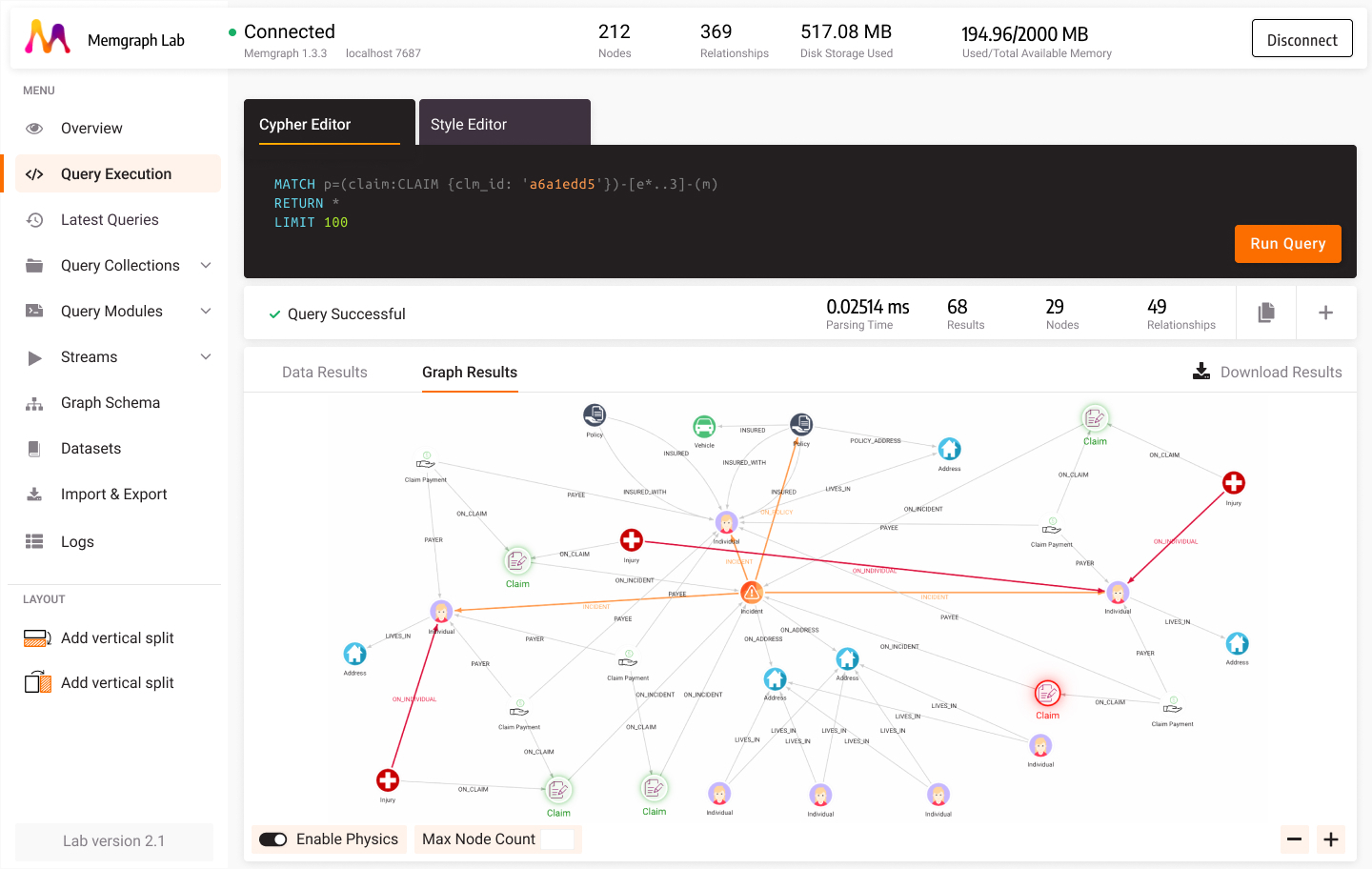
Figure 2. Visualization of insurance data with Memgraph Lab
By using graph algorithms, you can get more complex information from your data. For example, first, you run the community detection algorithm in Memgraph to assign a community to each node:
CALL community_detection.get()
YIELD node, community_id
SET node.community = community_id
RETURN *;
Community detection algorithms look for groupings of nodes based on how connected they are to each other. Then, run a query showing the communities of fraudulent claims and other claims are associated with them so that you can see if there is anything suspicious going on there:
MATCH (n:CLAIM {fraud: true}), (m)
WHERE n.community = m.community
OPTIONAL MATCH (m)-[e]-(a)
WHERE m.community = a.community
RETURN *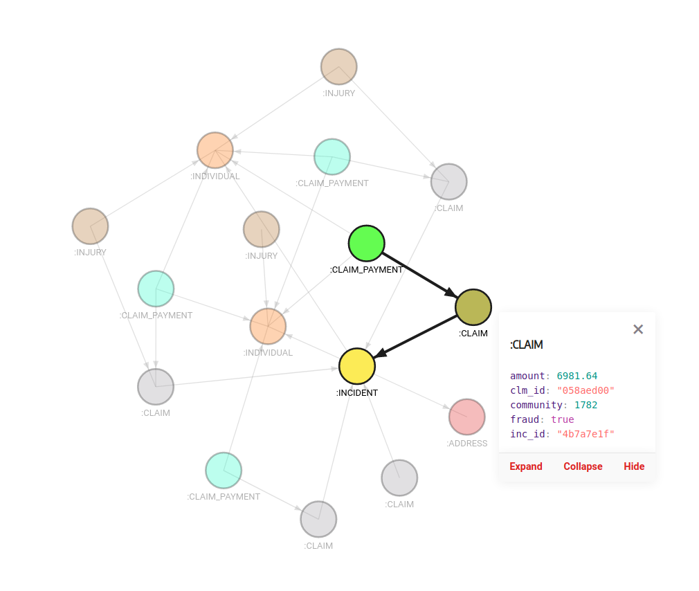
Figure 3. The fraudulent claim involved in an incident and its community containing other, possibly suspicious, claims
Another algorithm you can run to gauge an influence of a node (claim, individual) is PageRank, the famous algorithm used by Google to rank web pages in their search results. As it is available in our MAGE library of graph algorithms, call it with the following query:
CALL pagerank_online.set(100, 0.2) YIELD node, rank
SET node.influence = rank;
Now, set the node size in the graph view to be proportional to its rank, or influence, set by the PageRank algorithm:
@NodeStyle {
  size: Sqrt(Mul(Property(node, "influence"), 200000))
The influence property is multiplied to scale, then the square root of the value is calculated to smooth the difference between very influential and less influential nodes. The query below will generate results that show the individual connected to two different incidents is more relevant than other nodes, as shown in figure 4.
MATCH (n:INCIDENT)
OPTIONAL MATCH p=(n:INCIDENT)-[e]-()
RETURN *;
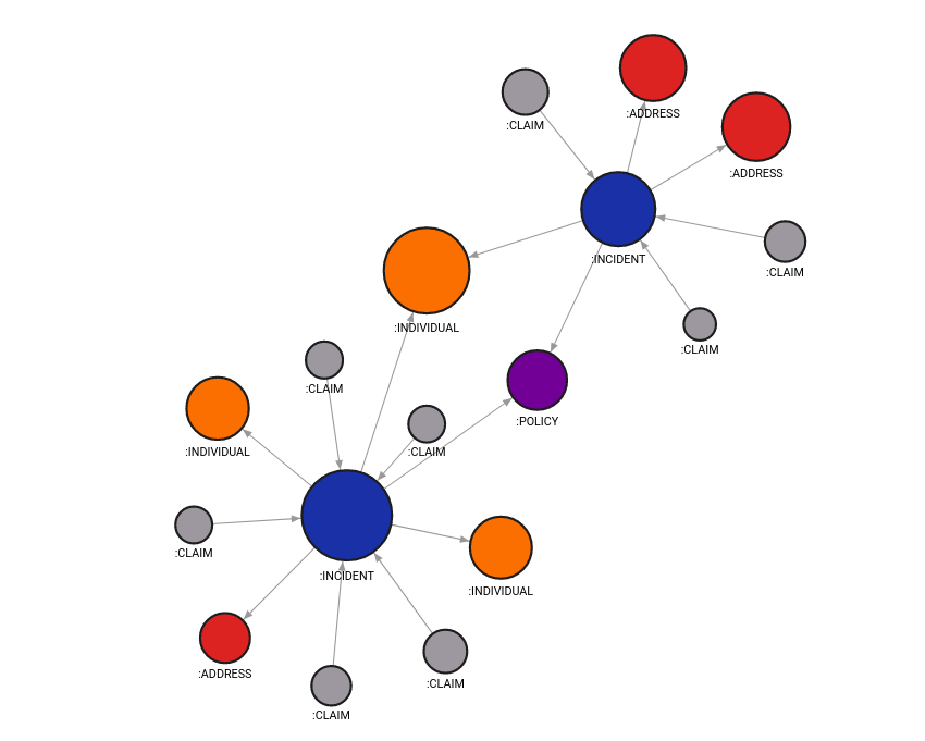
Figure 4. Incidents and their connected nodes
As shown with these examples, visualizations can be customized using the Graph Style Script by changing many aspects of nodes and relationships. By applying certain styles, you can highlight fraudulent claims or their connections to certain individuals and pinpoint extremely large claims that might prove suspicious.
Another feature Memgraph Lab offers is the automatic recognition of geographical data such as latitude and longitude properties. The data can be shown on a map, like in the heavily stylized example in Figure 5.
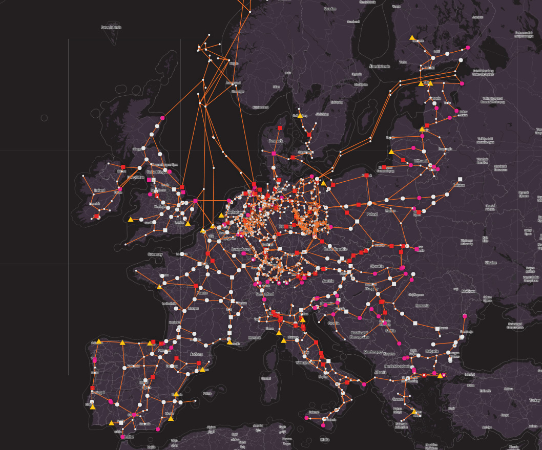
Figure 5. An example of a geographical graph
This feature can be used with insurance data to map out the locations of incidents. If certain locations prove to be frequently stated in insurance claims, you can investigate further as to why the accidents happen precisely at that spot and possibly discover an elaborate ruse.
Orb data visualization library
This high-level visualization is enabled by Memgraph’s library Orb, a visualization engine for graphs. It can be used in a browser environment by importing a script, or in a JavaScript/TypeScript project through npm install.
Once you try out Lab, you will be familiar with the look and feel of Orb. You can use it to make custom visualizations and integrate the rendering engine into any internal product or app you might use for handling and analyzing insurance data, for example, you can use it to create a dashboard for insurance agents to track and inspect incidents.
Orb can also track events such as node/edge clicked, render started etc. You can subscribe to those events and do any action on top of them. You can use this feature with a tool that will help agents quickly go through many insurance claims and by interacting with the graph mark claims that have been looked into or have been suspected of being fraudulent. You could also make the interface interactive by allowing agents to create nodes and edges without doing Cypher queries.
Orb also supports physics simulations to change the graph's structure dynamically, thus creating visualizations you need to make your data show exactly what it represents.
If you are interested in Orb, check how to customize physics simulations, events, styling, etc.
Conclusion
Research shows that the human brain processes image 60,000 times faster than text. Visuals also extend the human capacity to take in, comprehend, and synthesize large amounts of new information more efficiently, especially to find patterns and relationships.
Sixty-five percent of the population are visual learners, and the information from visuals is stored in the long-term memory quicker and stays there longer. All in all, images speak louder than just data in tables and reports.
That is why visualizations are such an important part of a graph database, and Memgraph took a lot of time to perfect its visualization tools - Memgraph Lab and Orb library. Once the data is modeled and imported into Memgraph, run powerful analytics such as machine learning to generate graph results. Then, customize those results to efficiently gain insight the way humans are built to learn - using our visual senses.
Explore insurance fraud through a lesson on Memgraph Playground that will show you how to use various Cypher queries and graph algorithms to pinpoint fraudulent activities.