
Why Graphs Are a Natural Fit for Wrestling Data
The 2025 United World Wrestling world championships are to be held in Zagreb, Croatia from September 13th to September 21st, 2025. Conveniently, that’s also Memgraph’s backyard! It’s the perfect moment to show how graphs uncover wrestling stories that flat tables can’t.
At it’s core, wrestling boils down to one metric: who beat whom. That’s a relationship, not a row. Tables flatten it, but graphs preserve it.
Why Wrestling Data is Messy
- Fragmented ecosystem: Worlds, continentals, national trials, age levels, pro tours (multiple styles and overlapping calendars).
- Sparse bout detail: Often just winner/loser plus final score; action-by-action sheets are rare.
- Bout-level density: At the macro level, record-keeping is inconsistent and sparse, but individual bouts are information-dense. You need a model where that density can live on the relationship.
- Context matters: Finals matter more than qualifiers; recent bouts more than old; event prestige and style affect how much a win should “count.”
Why Graphs Work for Wrestling Data
- Intuitive structure: The same model expresses “A beat B” and a 128-person bracket. Domain logic maps directly to data.
- Flexible schema: Add or refine properties (e.g., stage, cautions, criteria) without brittle migrations.
- Edges as first-class facts: How entities connect is data, not just a join. Relationships can be typed, addressable, and carry their own schema and provenance.
- Context in the math: Counts of bouts, sum of wins, and margin of victory can be modeled on edges; run algorithms on projected subgraphs (e.g., season + weight class) instead of the whole world.
Visualizing Wrestling Graphs with Memgraph
The fastest way to appreciate graphs, especially for wrestling, is to see them. Like a bar chart suits tightly structured data, a graph suits connected data. We’ll walk through two examples:
- Weight Communities: Multiple events merged to reveal weight classes and migrations from non-Olympic to Olympic weights.
- Bracket Power Map: One event + One weight (e.g., 57 kg at Worlds).
We’ll keep the code small and focus on the bits that matter.
Official PDFs to Weight Migrations
For each United World Wrestling event, a PDF revealing official results is published. With some light scraping and some Python parsing, a stack of PDFs becomes a queryable graph.
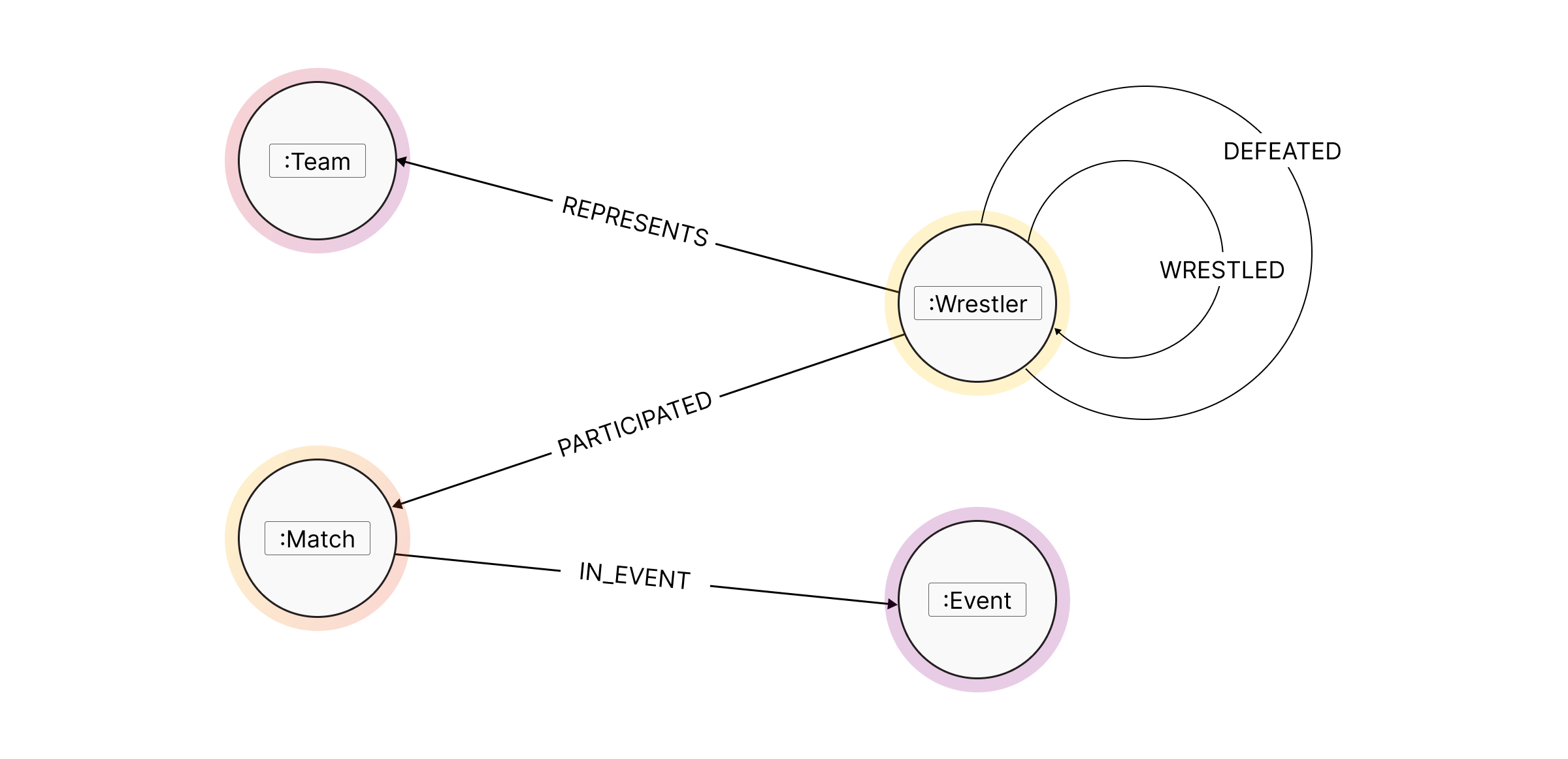
The schema looks simple, but it’s information-rich! With ~8,000 bouts, the entire graph was rendered with default settings.
A few things stood out:
- Large clusters
- Visible connections between clusters
- One main component with many small disconnected communities
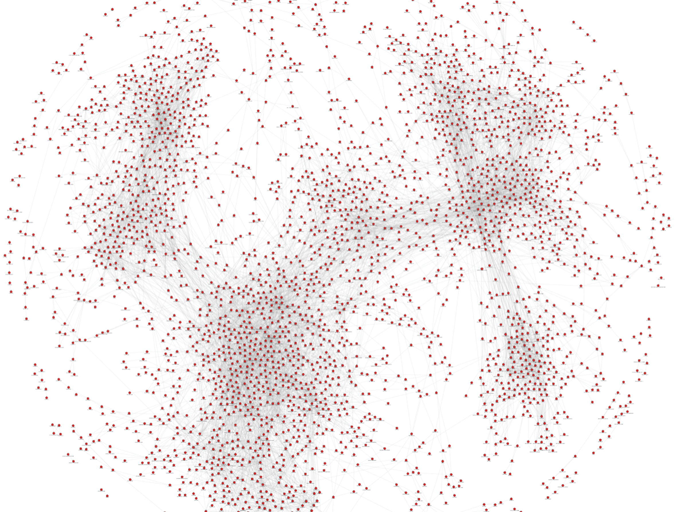
The default force layout wasn’t random, it hinted at structure.
To expose the story, the graph was first de-noised by computing Weakly Connected Components and keeping only the giant component (the subgraph where almost everyone is reachable).
Then Leiden community detection was run on that component (on an undirected, un-weighted projection). What began as rows in a CSV became clusters of wrestlers that actually interact, both within and between weight classes.
Here’s how that looks in Cypher/GSS:
// cypher to query and assign community
MATCH p=(a:Wrestler)-[d:WRESTLED]->(b:Wrestler)
WHERE a.wcc = '0' // the largest component (run prior)
	and id(a) < id(b)
WITH project(p) AS g
CALL leiden_community_detection.get(g, n) YIELD node, community_id
SET node.community_id = community_id;
// GSS to color nodes by community_id property
Define(COLOR_PALETTE, AsArray(
  #DD2222, #FB6E00, #FFC500, #720096,
  #5E4FA2, #3288BD, #66C2A5, #ABDDA4,
  #E6F598, #FEE08B, #D53E4F, #9E0142
))
Define(COLOR_PALETTE_ITER, AsIterator(COLOR_PALETTE))

// If there are no palette colors to use, use random colors instead
Define(RandomColor, Function(RGB(RandomInt(255), RandomInt(255), RandomInt(255))))
Define(GetNextColor, Function(
  Coalesce(Next(COLOR_PALETTE_ITER), RandomColor())
))
 // Cache map to keep a selected color for each community ID
Define(ColorByCommunity, AsMap())
Define(GetColorByCommunity, Function(community_id, Coalesce(
  Get(ColorByCommunity, community_id),
  Set(ColorByCommunity, community_id, GetNextColor())
)))

// Baseline node style that will be applied to every single node
@NodeStyle {
  Define(COMMUNITY_ID, Property(node, "community_id"))
  Define(COLOR, GetColorByCommunity(COMMUNITY_ID))
  ... // other properties
  color: COLOR
  ... // more properties
  }
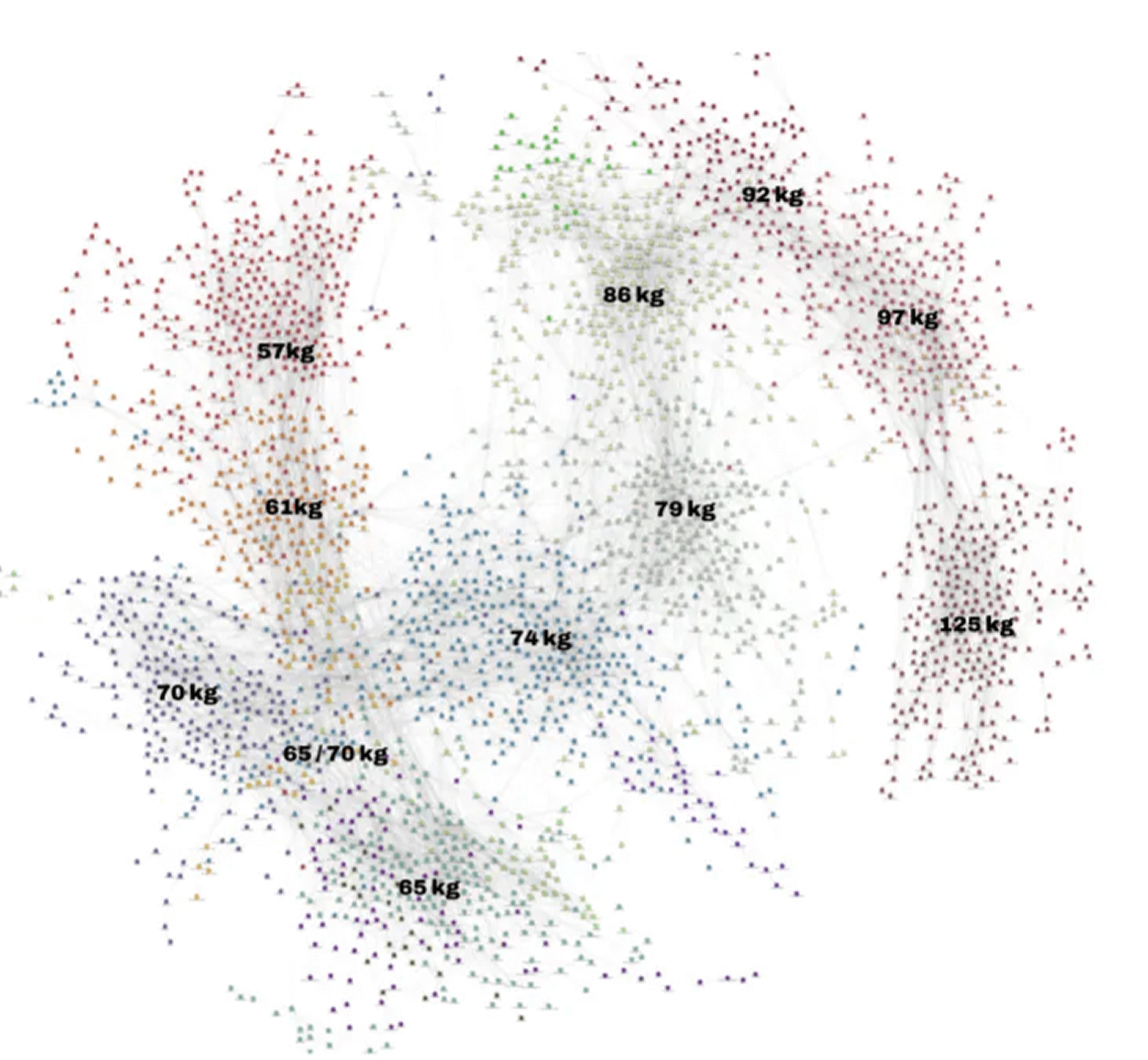
Two patterns pop immediately:
- The Olympic weights (57/65/74/86/97/125 kg) form tighter, more insular clusters
- The non-Olympic weights (61/70/79/92 kg) act as bridges. They’re where the athletes jump up or down, creating the majority of inter-cluster links. That bridge structure is why those four weights often “light up” the boundaries between communities.
From Macro Views to 57 Kilo Projections
Leading up to Worlds, outlets produce weight-by-weight previews. Because of the data issues above, those previews often end up shallow and repetitive. Graphs help when the signal is in the relationships
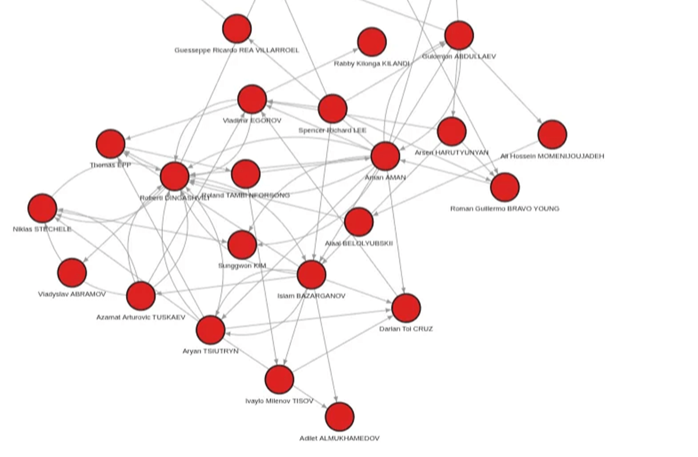
The first step was to tag the roster of likely 57 kg entrants (uww_57_entry = true) and render the default view. The graph showed who wrestled whom, but it didn’t clearly highlight the names, the win/loss balance, or which wins actually mattered.
Starting from there, the next step was to build a projection suited for influence scoring. For every (:Wrestler)-[:DEFEATED]->(:Wrestler) edge, a reverse [:DEFEATED_BY] edge (loser → winner) was added, and defeats were aggregated into a count.
PageRank then flowed along these edges, so a win “received votes” both from the opponent and from anyone that opponent had beaten. The graph was then restricted to the 57 kg cohort (both endpoints tagged), PageRank was run on the projection, and the score was stored on each node (pr).
// Run PageRank on the induced 57 kg subgraph (winner gets the incoming flow)
(winner gets the incoming flow)
MATCH p=(a:Wrestler)-[:DEFEATED_BY]->(b:Wrestler)
WHERE a.uww_57_entry AND b.uww_57_entry
WITH project(p) AS g
CALL pagerank.get(g) YIELD node, rank
SET node.pr = rank;
Separately, cohort-only win percentage (%) was computed (wins and total matches only against other tagged 57 kg entries), and profile photos were pulled from the UWW site to enrich the visualization.
// compute cohort-only win%
MATCH (w:Wrestler) WHERE w.uww_57_entry
OPTIONAL MATCH (w)-[:DEFEATED]->(op) WHERE op.uww_57_entry
WITH w, count(op) AS wins
OPTIONAL MATCH (w)-[:DEFEATED]-(all) WHERE all.uww_57_entry
WITH w, wins, count(all) AS total
SET w.win_pct = CASE WHEN total>0 THEN round(100.0 * wins / total) ELSE 0 END;
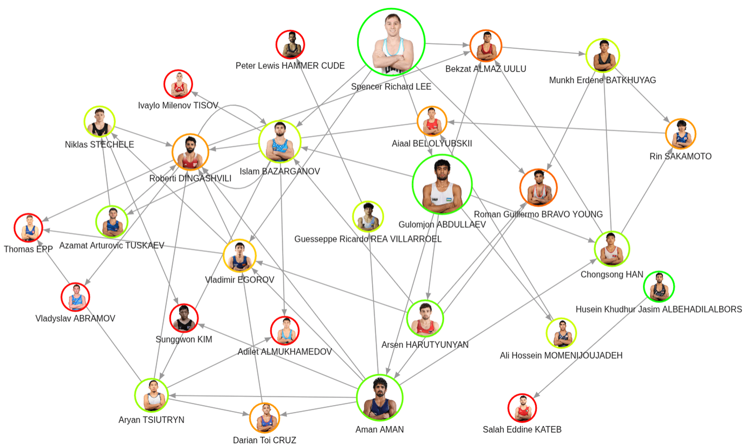
Interpreting the Graph Visualization
- Size → PageRank (models quality of wins in the 57 kg cohort)
- Ring color → Win percentage within the cohort
- Arrows → Head-to-head wins (who beat whom)
Three wrestlers stood out in both win percentage and quality of wins. Even without prior knowledge, this graph highlights the contenders to watch going into the tournament.
Wrapping Up
At the start we had PDFs and a tangled dataset; by the end we had two readable stories:
- Macro: Weight communities where non-Olympic classes bridge otherwise tight Olympic clusters.
- Micro (57 kg): An influence map where PageRank and cohort win percentage surface real contenders.
The common thread is edges as first-class facts. The bout truly lives on the connections of date, round, style, prestige, and provenance. Graphs allow you to de-noise (Weakly Connected Components), organize (Leiden), and evaluate (PageRank) the wrestling data without flattening away the thing that matters most: who wrestles whom.