
Graph Visualization in Python
Python graph visualization is useful when you need to inspect relationships, debug graph data, and spot structural patterns quickly. For Memgraph users, it helps before or after querying graph data so you can validate results, explore connected data, and understand how a graph behaves in practice. In this post, we’ll look at two practical Python options for that workflow: Pyvis and Jaal.
Prerequisites
To follow the examples in this post, install:
- Python 3
- pip
- venv for an isolated Python environment
- Jupyter Notebook or JupyterLab if you want to run the examples in a notebook
These visualization workflows are still useful for notebooks, analytics prototypes, and graph-enabled AI applications where you want to inspect relationships before moving to a production UI.
Pyvis
Pyvis is a Python library that simplifies the creation of interactive network graphs in a few lines of code. Start by installing the dependencies used in this example:
python -m pip install pyvis pandasAfter that, import Pyvis and the Network module:
import pyvis
import pandas as pd
from pyvis.network import Network

pyvis.__version__
Visualizing a Social Network
Let’s visualize an actual social network. We’ll use a dataset containing Facebook friend lists and limit our visualization to 1000 samples since this dataset is quite big with 88234 samples. Download the facebook_combined.txt file from the dataset page and place it in your working directory before running the code below.
#Loading the data
from pathlib import Path

dataset_path = Path("facebook_combined.txt")
if not dataset_path.exists():
    raise FileNotFoundError(
        "Download facebook_combined.txt from the SNAP dataset page and place it in your working directory."
    )

data = pd.read_csv("facebook_combined.txt", sep=" ", header=None)
data.columns = ["person1", "person2"]
sample = data.sample(1000, random_state = 1)
sample.head(10)
To construct a network graph, start by creating an instance of the Network object. For visualization within a notebook, set notebook to True and choose cdn_resources to be remote. We'll set the nodes to be a unique list of people in the dataset and use the values of each row as source and destination nodes for each relationship. We’ll also use a dark background color and white font color. If you're running this as a script instead of in Jupyter, net.show("graph.html") will save the output to an HTML file you can open in your browser.
#Creating a network graph
net = Network(notebook = True, cdn_resources = "remote",
                bgcolor = "#222222",
                font_color = "white",
                height = "750px",
                width = "100%",
)
nodes = list(set([*sample.person1,*sample.person2]))
edges = sample.values.tolist()
net.add_nodes(nodes)
net.add_edges(edges)
net.show("graph.html")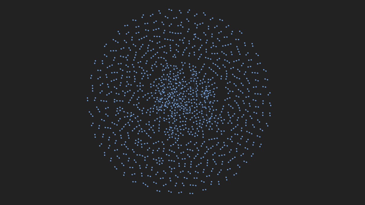
Filtering Graph Results
With the graph now containing numerous nodes and relationships, we can filter and select nodes by adding the select_menu and filter_menu options as arguments. Now, we get a select bar and a filter bar. By specifying the ID of a node, we can select and highlight it, along with its adjacent edges and nodes.
net = Network(notebook = True, cdn_resources = "remote",
                bgcolor = "#222222",
                font_color = "white",
                height = "750px",
                width = "100%",
                select_menu = True,
                filter_menu = True,
)
nodes = list(set([*sample.person1,*sample.person2]))
edges = sample.values.tolist()
net.add_nodes(nodes)
net.add_edges(edges)
net.show("graph_with_menu.html")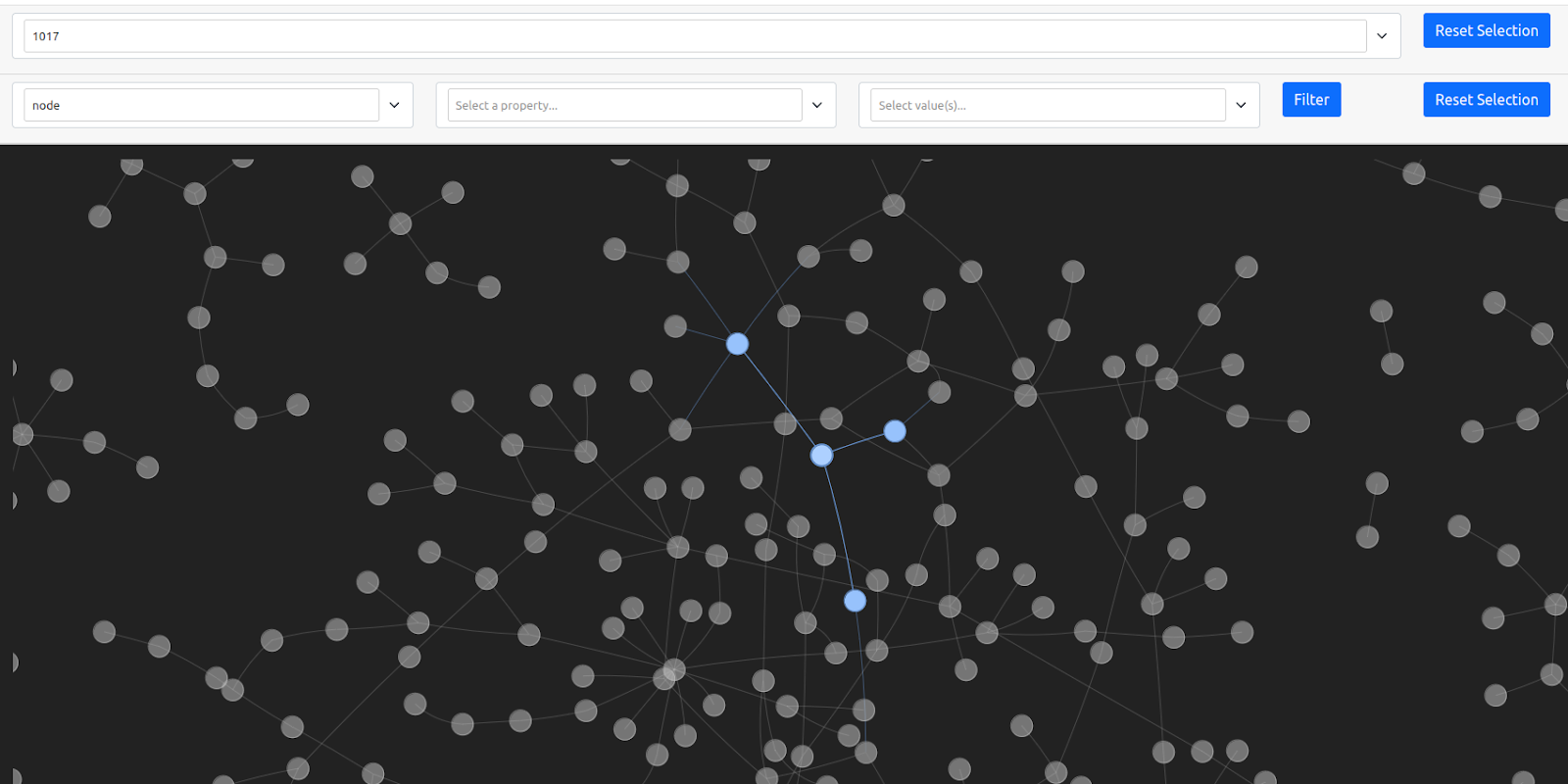
Adjusting Graph Physics
The graph’s physics can be adjusted using the show_buttons method with the filter_ parameter set to physics. Altering parameters can yield intriguing visual effects.
net.show_buttons(filter_=["physics"])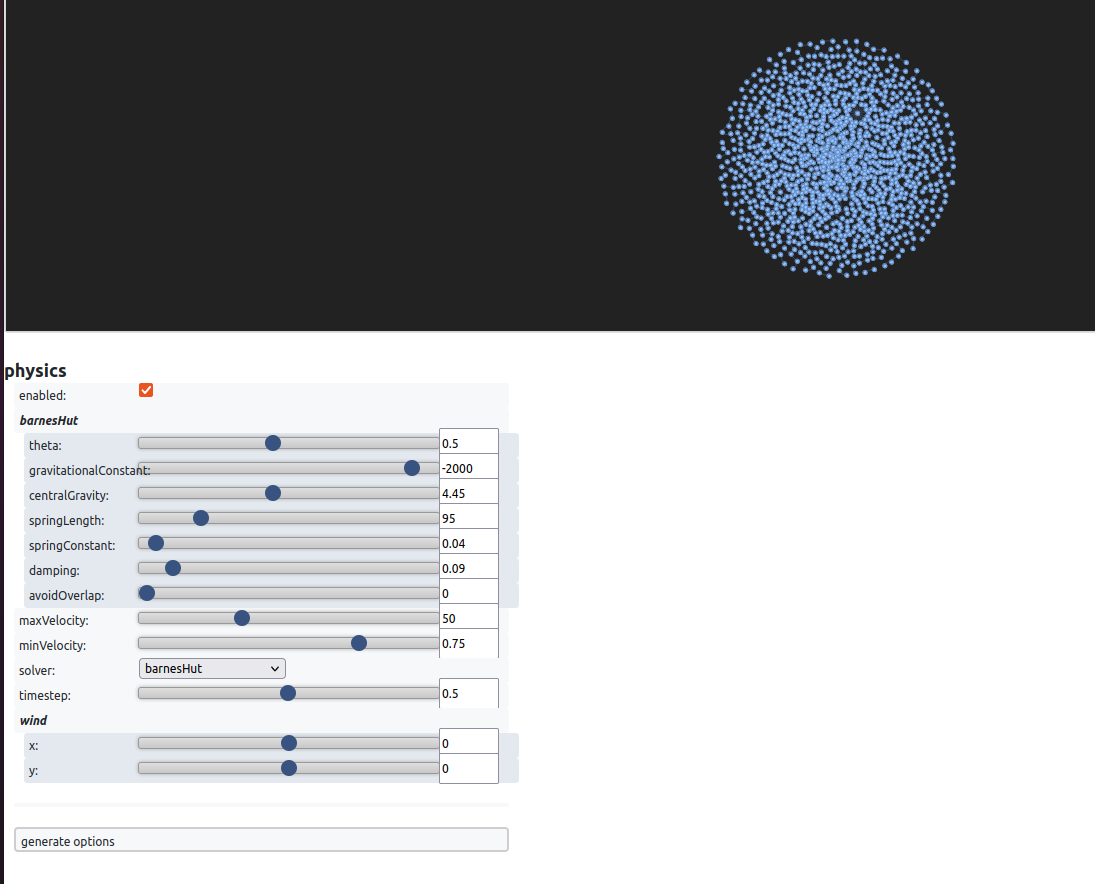
After running the code, you will see the physics settings. For example, with the increase of the central gravity, nodes try to get to the middle because the gravity in the center of the graph increases, as shown in the picture above. If the spring length is increased, the distance between the nodes increases. I encourage you to explore various settings to achieve the desired visual impact. To replicate an effect, you can click generate options, copy the dictionary, and paste it into net.set_options.
Jaal
Jaal is a Python-based interactive network visualization tool built by Mohit Mayank on the Dash and Visdcc libraries. Install it in your active virtual environment before trying the example:
python -m pip install jaalOnce Jaal is installed, you can fetch data and create visualizations. Let’s explore this with the Game of Thrones dataset included in the package.
To visualize a network using Jaal, start by importing the Jaal main class and the dataset loading function, such as load_got. After that, load the Game of Thrones dataset using the provided function, resulting in two dataframes: edge_df, a pandas dataframe representing relationships, and node_df, an optional dataframe with unique node names. With the data loaded, pass it into Jaal and call the plot function. This action will launch Jaal on your localhost (127.0.0.1:8050), allowing you to interactively explore your network data. You can also use Jaal in your Jupyter notebook.
from jaal import Jaal
from jaal.datasets import load_got

#load the data
edge_df, node_df = load_got()

#init Jaal and run server
Jaal(edge_df, node_df).plot()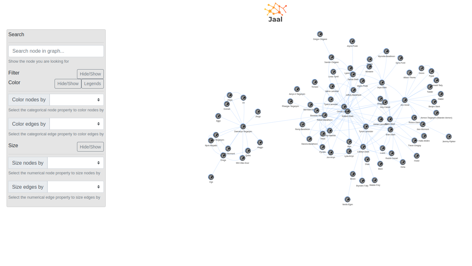
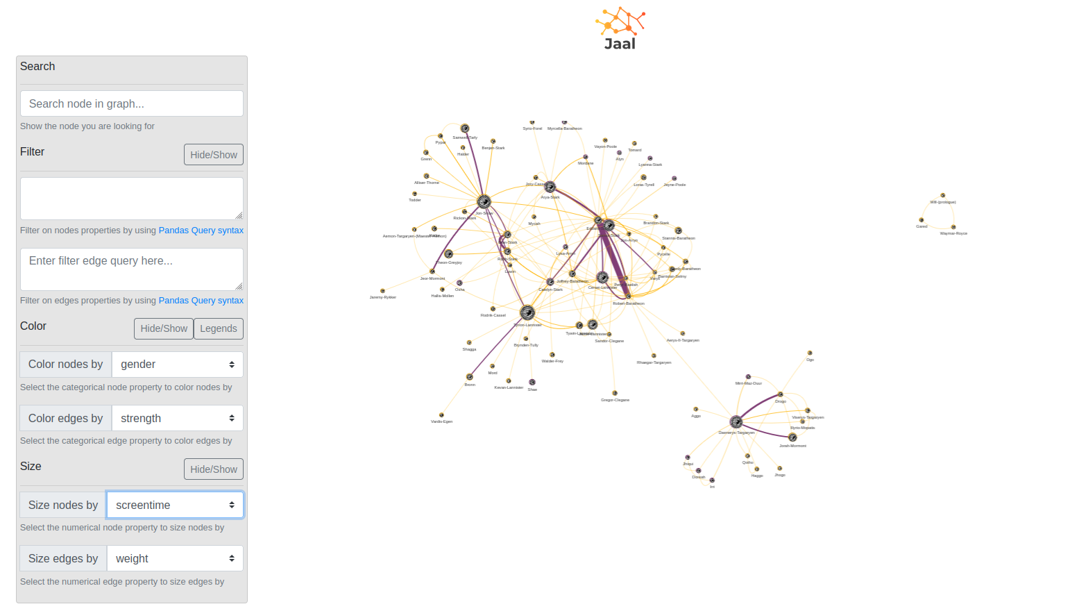
Jaal provides a dashboard with a settings panel on the left and a dynamic graph visualization on the right, making it a useful tool for network analysis. The Jaal dashboard consists of several sections, with the Settings Panel offering various options for graph data manipulation. Within this panel, you’ll find tools such as Search, enabling character-by-character node searching, Filter, which supports filtering based on node or relationship features using Pandas query language, and Color, allowing nodes and relationships to be color-coded based on categorical features.
Searching, Filtering, and Coloring Graph Data
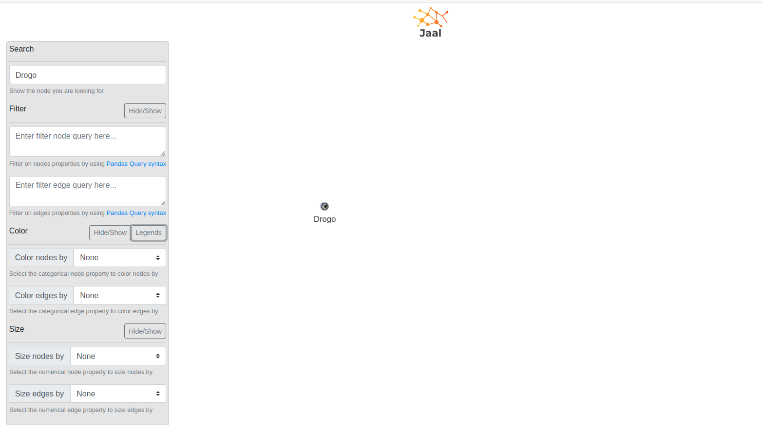
When it comes to searching, Jaal allows you to search for specific nodes within the graph, making it simple to find characters like Drogo.
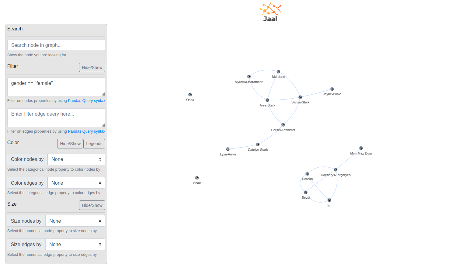
Jaal supports filtering on both node and edge features, offering live previews of the filtering queries’ effects. For instance, you can filter nodes based on criteria like gender == "female" and/or edges with conditions like weight > 20.
Coloring nodes and relationships is another valuable feature in Jaal. By using categorical features, you can visually represent feature distributions within the graph by color-coding elements, enhancing your understanding of the network’s characteristics and relationships.
Wrapping Up
Python graph visualization is a practical way to inspect connected data before or after working with it in Memgraph. If you’re choosing between tools:
- Use Pyvis for lightweight interactive graph visualization in notebooks.
- Use Jaal when you want dashboard-style filtering, search, and coloring.
- Use Memgraph Lab when you want to visually explore graph data stored in Memgraph. For setup and usage details, see the Memgraph Lab docs.
The right choice depends on whether you need a quick notebook view, an interactive dashboard, or direct exploration of graph data already stored in Memgraph. Whichever option you choose, the goal is the same: make graph structure easier to inspect so you can reason about the data with less guesswork.